10 Call to Action Best Practices for PPC Landing Pages
Create compelling calls-to-action (CTAs) that drive clicks, increase engagement, and elevate the success of your PPC campaigns.

When it comes to pay per click advertising, getting people to click on your PPC ad is only half the battle. Once visitors land on your PPC landing page, the real work begins. From there, you also need them to click on the call to action (CTA) on your landing page.
That’s the only way to actually convert leads. So if your landing pages are struggling to convert visitors, maybe it’s your CTA.
If your landing page is weak, cluttered, or disconnected from the ad copy, your paid traffic will leave quickly. That means wasted ad spend, poor conversion rate, and underperforming PPC campaigns.
A good PPC landing page solves this. A dedicated PPC landing page focuses on one goal, supports the desired action, and aligns perfectly with the ad's message. This improves message match, strengthens ad relevance, and contributes to better quality score and ad rank in google ads.
Fortunately, there are many ways to get more users to click on your CTAs in your PPC landing page. You just need to learn the tricks of the trade.
In this article, we’ll go over what those landing page CTA best practices are to improve conversion rate optimization and overall campaign performance, but first, let’s define what a CTA is in the first place.
What Is a Call to Action?
A call to action (CTA) is the most important part of a PPC landing page. It’s what converts visitors into leads and drives your conversion goals.
Basically, a CTA is a prompt that invites users to take a specific action.
Most CTAs offer something valuable (like a free ebook download or newsletter signup) in exchange for the user’s contact information (like their name and email address).
The point of the CTA is to lead potential customers into your sales funnel. From there, you can nurture them with more valuable content until they eventually make a purchase.
So how do you make the CTAs on your landing pages as effective as possible? Here are ten tips:
1. Design an Effective CTA Button
The call to action button is just what it sounds like. It’s a virtual button on your landing page that contains the CTA text. For example, the call to action button might be a green rectangle that includes the words “Download Your Free Ebook.”
Whatever your call to action button is, you want it to stand out from the rest of the page. Your CTA button is one of the most important key elements on any PPC landing page. A strong CTA helps guide PPC traffic toward the desired action without hesitation. To do this, you can use a different text font (e.g., bolded or italic) and contrasting colors.
Humans are visual creatures, which means (among other things) that we are naturally attracted to sharp variations in colors. You can use this to your advantage by playing off different color contrasts. For example, if your landing page background is blue, you might make your call to action button orange so it really stands out.
You can also try using a free online color scheme generator to come up with ideas. A good CTA example would be one that blends seamlessly with the rest of the page elements while still grabbing users’ attention.
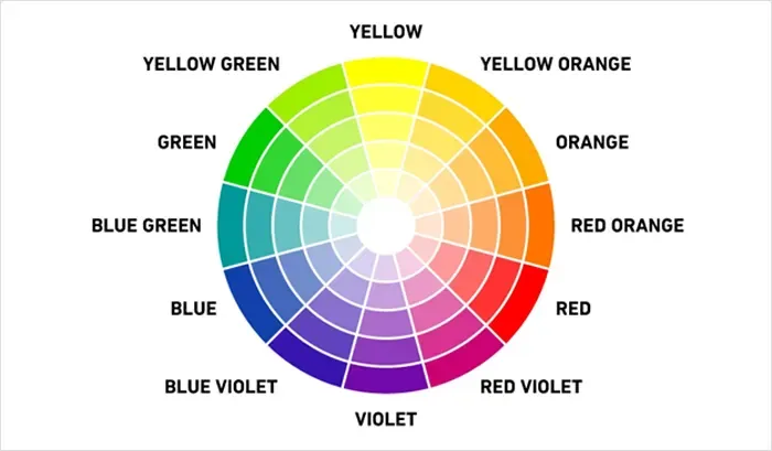
Source: https://www.shutterstock.com/blog/color-scheme-definitions-types-examples
Another way to make your call to action button stand out on the landing page is to play with its size and page layouts. Make it big enough to call attention but not so big that it becomes too distracting from reading the rest of the page. On a cluttered page, your CTA gets lost. On a focused standalone web page, it becomes the natural next step.
By focusing on the visual design of your call to action button, you can encourage users to click on it and improve the overall conversion rate of your marketing campaigns. A well-designed CTA improves conversion rate and reduces drop off points, especially for cold traffic coming from a search ad.
2. Choose Your Words Carefully
When writing a call to action, it’s easy to resort to phrases like “contact us” or “learn more.” But such calls to action are so overused that many people gloss over them.
Instead, try to put yourself in your target customers' shoes. What are their pain points? Then craft your CTA according to that. Your CTA copy should match user intent and clearly reflect what the PPC ad promised.
For example, if your target customers have a hard time remembering birthdays, lure them in with a CTA that says “Install this scheduling tool to never forget another birthday.” It’s much more specific and tailored to the value proposition your service provides. This improves ad relevance and helps your PPC campaigns perform better across search engines.
That said, you also need to make sure you keep your CTA clear and to the point. Most people skim the internet, whether they’re reading a blog post or browsing an online store. So if your CTA copy is too long or clever, people will probably move on. And if you can’t convince them to click on your call to action button the first time, they probably never will.
So make your CTA crystal clear. Say exactly what you want the web visitor to do and exactly what they’ll get by clicking. Use action words to evoke a quick reaction. Your CTA should reinforce the ad's message and support strong message match.
By writing clearly and directly, your CTA will be much more persuasive.
3. Place the CTA Where It Can Always Be Seen
A PPC landing page should never hide its CTA. The last thing you want is for visitors to be looking for a call to action button on your landing page and not find it.
To ensure people always have the opportunity to click the call to action button, place it somewhere it can always be seen. For example, you could include it in a floating header or footer that moves along the landing page as the user scrolls up or down.
The point is you want the CTA placement to be visible, no matter where the web visitors land on the page. If you only place it at the end of the page, visitors may never get to it or see it.
Strong PPC landing page examples often use sticky elements or repeated CTAs to reduce drop off points and guide paid traffic efficiently.
The call to action button should be easy to locate. So, place it where it makes the most sense, whether on desktops or mobile devices.
4. Find the Right CTA Frequency
That said, you don’t want to include so many calls to action that you come across as too pushy or spammy. This will only turn people off.
But you also don’t want web visitors to leave your page without clicking on the call to action button. Otherwise, what’s the point?
So, find the right CTA frequency balance.
Too few CTAs and users leave without converting. Too many and you confuse users.
A good PPC landing page maintains a clean structure while reinforcing the same desired action throughout the landing page. This keeps your PPC landing experience focused and effective.
5. Use Only One Type of CTA per Landing Page
Each PPC landing page should focus on one goal. Even if you place multiple CTAs across your landing page, you want to stick to just one kind. Here’s what I mean:
If the landing page’s main purpose is to get visitors to sign up for your email marketing list, don’t also include CTAs to order a product off your website.
You can have multiple CTAs, but they shouldn’t call on visitors to perform more than one action.
Why? Asking target customers to do more than one thing can be confusing. In fact, this may overwhelm them so that they don’t click on any call to action button at all, weakening the conversion rate.
If you have multiple marketing campaigns running, create separate landing pages for each of them. That way, each blog post or landing page is focused on one specific value proposition and action.
A dedicated landing pages approach works best, where each ad group leads to a specific PPC landing page.
This improves message match, strengthens ad relevance, and supports better quality score in Google Ads.
6. Direct People to Your CTA with Visual Cues
Having an attractive CTA is not enough. You also need to direct visitors’ attention to it with visual cues.
You can do this in two ways: subtle or not-so-subtle cues.
A subtle visual cue could be images or converging lines whose linear pathways indirectly point toward the CTA—like a photo of someone whose eyes are looking at the CTA. Users will then subconsciously want to look there, too. A clean standalone web experience helps keep attention on the desired action.

Source: https://instapage.com/blog/what-are-visual-cues
A conspicuous visual cue could be bright red arrows that point toward the CTA. This can also be effective, but you must be careful not to make it appear too distracting or promotional.
Whatever you do, you want your landing page to have a clean visual flow that ultimately directs users to the CTA button. Strong PPC landing page design ensures users naturally move toward the CTA without friction.
7. Use White Space to Your Advantage
Another way to make your CTA stand out is to put white space around it.
White space (aka negative space) refers to the areas of your PPC landing page that don’t have any text or images—nothing.
While you might think white space is a waste of precious real estate, it’s not. It actually helps provide some balance to your landing page and, if used artfully, can actually make your CTA stand out.
For one, if you leave a lot of white space around the CTA, it won’t look cluttered—like it’s drowning in text and graphics. Instead of a cluttered page, it will stand out because it’s set off by itself. It improves readability and keeps your landing page easy to scan for PPC traffic. This is especially important for paid search visitors who want quick clarity.
Play with the white space around your CTA to call more attention to it.

Source: https://www.interaction-design.org/literature/article/the-power-of-white-space
8. Show Off the Benefits of What You Have to Offer
To stand out, your CTA also has to offer something unique. What are the benefits of clicking on it? How will it improve your visitors’ lives? What’s in it for them? If your CTA doesn’t answer these questions, you may want to rethink it.
A good PPC landing page explains what users gain by taking action. Whether it is saving time, making money, or solving a problem, your message should align with the target audience.
Consider your typical visitor’s pain points. Then show how your offer is a solution to their problems. Including social proof can further strengthen trust and improve conversion rate.
For example, if your CTA is to sign up for a weekly newsletter that offers actionable tips on how to double your productivity, point that out. In this case, your CTA might read “Sign Up for My Weekly Newsletter to 2X Your Productivity.”
At the end of the day, concrete and relevant benefits help sell visitors on your CTA.
9. Appeal to the Emotions
People are heavily influenced by their emotions. Though the rational brain plays a role in the decision-making process, emotions play an arguably bigger one.
That’s why it’s important for your CTA to appeal to people’s emotions. If you tap into people’s emotions, visitors are more likely to pay attention and click. This strengthens message match with your search ad and encourages faster decisions from cold traffic.
For example, you might create a sense of urgency by promoting a limited-time offer. This may activate their fear of missing out (FOMO). Or you might appeal to their sense of danger with a CTA that says “Sign the Petition to Keep Your Neighborhood Safe.”
Don’t forget to also surround the CTA with relevant images (where appropriate). Combining emotional appeal with ad relevance improves engagement across your PPC campaigns.
So if, for example, the CTA calls on the reader to improve their life by getting a copy of your new self-help book, include a photo of someone reading the book with a smile on their face next to the CTA.
This will draw a more immediate emotional response from the user than words alone ever could. After all, a picture is worth a thousand words.
10. A/B Test Your Landing Page CTAs
Last but not least, subject your landing page CTAs to A/B tests.
Testing different variations helps improve conversion rate optimization. You can test CTA wording, button placement, or page layouts to see what works best.
An A/B test (aka split test) refers to developing two slightly different versions of something (in this case a CTA) and then running a test to see which performs better according to common marketing metrics like click-through rate (CTR) and conversion rate.
You could test a CTA’s button size, copy, color, font, placement, page frequency, and more. Just make sure to test only one variable at a time so you can narrow down what exactly is contributing to a CTAs performance.
By constantly conducting A/B tests, you can gradually fine-tune your landing page CTA until it becomes a reliable conversion machine. Over time, this improves your landing page experience, strengthens ad campaigns, and increases efficiency across your pay per click efforts.
Partner with PPC.co
Now that you know the best practices for crafting effective PPC landing page CTAs, you’re ready to take your marketing to the next level.
Don’t have the time or manpower to handle your ad campaigns? That’s okay. We’re here to help.
Partner with PPC.co to take advantage of our managed PPC services. We can help you run ads across Google, Bing, Facebook, LinkedIn, and more. Whatever your advertising needs, we have you covered.
We’ll also help you optimize your landing page CTAs so that they bring you more business. To get started, contact us for a free proposal. We look forward to chatting!